Recently, our work was featured in St. Louis Homes + Lifestyles for the Town and Country project. I’m super excited to share this with you all — click here to check it out!
One of my main goals as a designer is to ensure the homeowner’s kitchen is the perfect design for them, as well as making sure it complements the elegance of the rest of the home. A significant way for me to do this is to be brought into the building process early on. This always makes a huge difference in the final design, because we’re able to make suggestions and changes to the plan upfront.

1. Symmetry
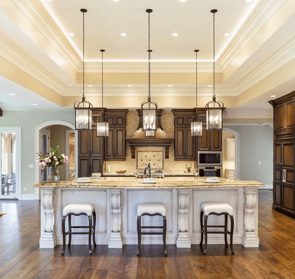
Intending to create a symmetrical kitchen in his newly built home, Town and Country builder, Jim New, of Monterey Custom Homes reached out to me during the blueprint phase of construction. Since he allowed me to be in the early phases of the project, we were able to make suggestions and changes to the plan. This allowed me to create a symmetrical kitchen centered around the hood, which is the focal point of the room.
2. Balance
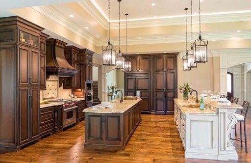
Along with balance, we knew the kitchen design had to include traditional details such as warm, natural elements and plenty of space to entertain large crowds with ease. To complete the balance, I flanked each side of the custom-shaped wood hood with tall, shadow-glazed cabinetry, a steam oven, oven, and microwave. The architectural ceiling element further elaborates the symmetry of the space.

3. Perfect for Entertainment
Since some homeowners want to entertain guests more often than others, I suggested two parallel islands for the expansive space with a variety of custom storage solutions. It leaves the kitchen to be separated in the very best way — space for the cook and space for the guests. The island closest to the range is a cook’s dream with plenty of space for prepping meals. Deep drawers allow for storage of plate settings and pots and pans. Other features to be added include a large sink, dishwasher, double trash can, tea towel storage, and under-counter paper towel storage. We kept the cabinetry of the working island consistent with the surrounding cabinetry for continuity.
4. Luxurious Finishes
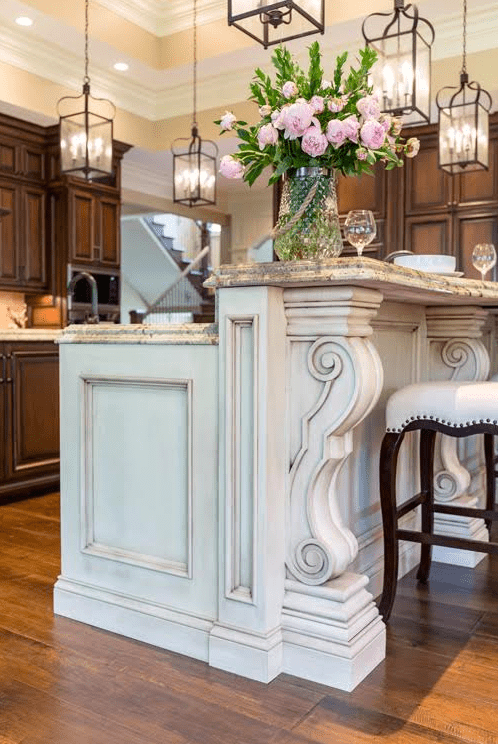
We decided to utilize the seating island for daily breakfast and for guests to enjoy while entertaining, as it looks into the adjoining great room. Overscaled intricate corbels accentuate the seating area in order to add a pop of elegant architectural detail. For the countertop, I chose a double-thick edge to accentuate the shape of the island. We used a soft, hand-brushed painted finish on the seating island to create a furniture-like transition from the great room into the kitchen.
To light the space, we took our time choosing fixtures with the right scale, finish and layout. The final choice was six identical fixtures that evenly light the islands. The glass around each fixture softened the light source.

5. Favorite Features
One of my favorite features in the kitchen is the hidden walk-in pantry, which I like to incorporate into designs whenever possible. A hidden pantry brings another level of interest to the space while making the simple task of grabbing staples from the pantry more fun to walk into than opening a closet door. Paneling the front of the Sub-Zero refrigerator, which is located next to the pantry, gives a flush feel of cabinetry to the wall for a more integrated and custom look.
Overall, we were able to create a beautifully symmetrical kitchen in a newly built home. Being brought in the early stages of the project allowed me to get a better idea of how certain designs would work. Click here to read the article featured in St. Louis Homes + Lifestyles magazine.
